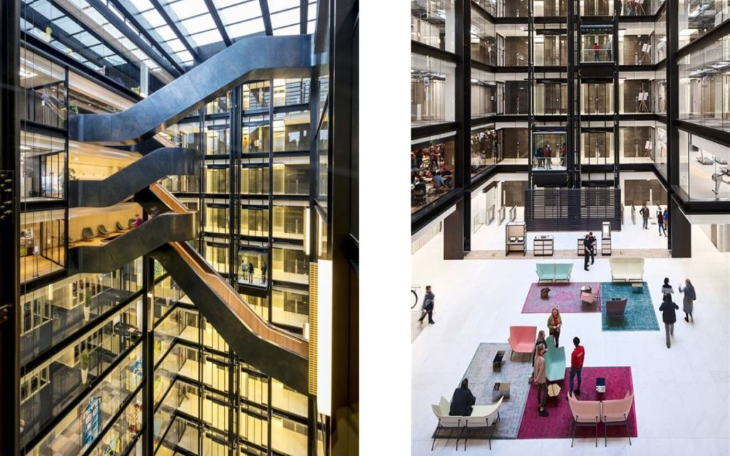
In 2018, as a part of the traditional John Colet Day outing, my tutor took us for a tour of Google’s King’s Cross headquarters in an ill-conceived attempt to keep the older members of the group away from the yearly pub crawl, set to follow that day’s church service. And while Google’s distinct corporate identity meant that its headquarters would have enough flair to be considered “quirky”, the interior still blew me away when I first saw it.
The design involves a central atrium that has enough natural light to give the illusion of being outdoors, flanked by the main rooms and offices that make up the bulk of the space. If you stand in the breakout area in the middle of the arrangement, as I did all those years ago, you feel very much like you are still on the pavement looking up at buildings from the outside, rather than the inside.
The concept is basic enough, and echoes a trend that’s been around for decades but that’s seen increasing prevalence in the last few years. However, this was still my first experience with it, and my mind was accordingly blown. Interior urbanism is the name for this principle of blurring the line between inside and outside in architecture, and it’s been cropping up in some interesting places. Corporate headquarters, airport hotels, public transport branches in Minneapolis, these places all have principles in common that interior urbanism has sought to exemplify.

We will start at what I’ve deemed the beginning, with the construction of the Hyatt Regency at O’Hare Airport in Chicago. This 1969 project by John Portman (pictured above) really takes this concept to its extreme, with its design offering an impressive sense of space to the residents of its over one thousand hotel rooms. I’d like to bring attention here to the natural lighting, as well as the breakout areas at the bottom that help to humanise the space, and prevent the large central elevator shaft from coming off as too imposing. These two features should be the main takeaways from these atrium-style designs for a reason, which I’ll be elaborating on shortly.

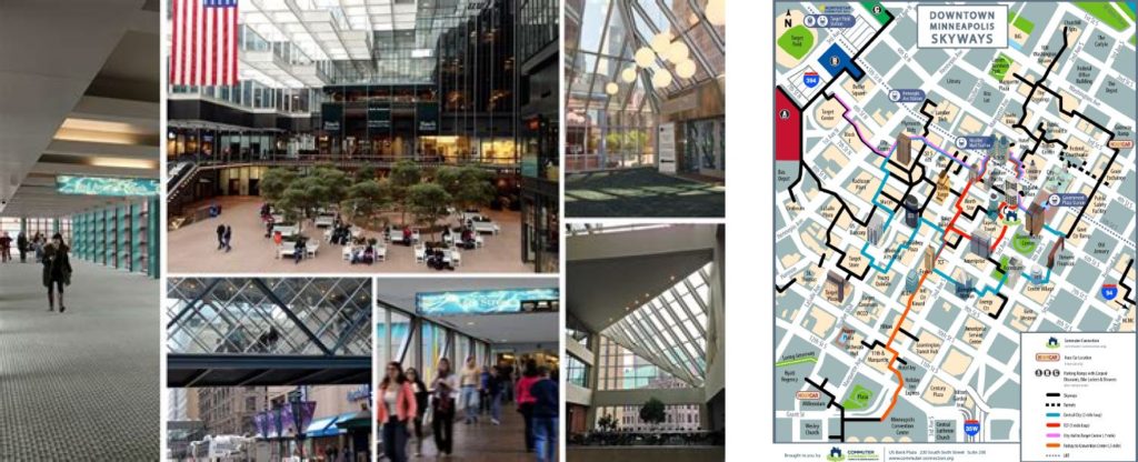
But first, let’s move across state lines and take a look at Minneapolis. With average lows of under -10℃ in winter, the city streets can become borderline inhospitable at times, and so the city introduced the Skyway, a gradually expanding network of tunnels between buildings that’s aiming to make journeys around the city feasible without having to step outside. This is a signature aspect of interior urbanism which you just can’t find in individual buildings. Taking the streets and moving them inside, essentially turning entire sections of the city into these sprawling, horizontal buildings is exactly what this design philosophy is about.
Now Chicago does have something similar, the Pedway. It is a similar system of tunnels designed for foot traffic, but one that runs underground. Despite this, I have chosen to look at Skyway in particular because of how it is presented. The Pedway is a mere means of transport, even the name should give that away, “Pedestrian Subway”. It’s just a metro without the trains. But the Skyway has far more of a social purpose. The way it's built means that it snakes around through restaurants and clubs, collating all of the city’s nightlife into one closed loop. The website even encourages this aspect, as the irregular closing times and maze-like structure can make navigating the Skyway by yourself rather challenging, and so first time users are told to “just ask someone who appears to be walking confidently for help”. Designing spaces to prioritise social interaction is another key strength of interior urbanism.
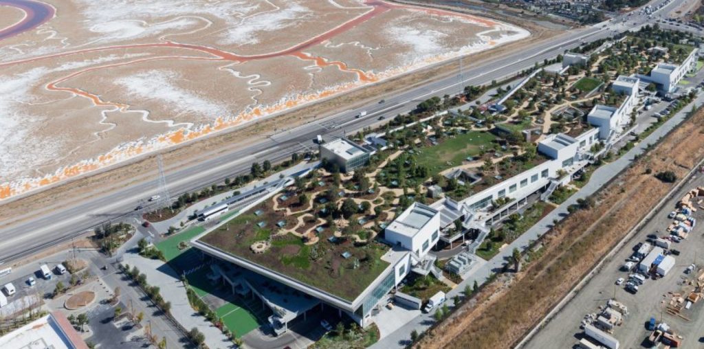
And finally, I would like to circle back to the tech industry and take a look at MPK21. Designed by Frank Gehry, it is an expansion of Facebook’s Menlo Park headquarters, with a design that seems to amplify the basic ideas behind Google’s King’s Cross headquarters. It is a space reminiscent of a town, with a “main street” area where all of the amenities are found, as well as “neighbourhoods” which are where the offices are. However it’s all kept inside for the most part, with the outdoor green spaces being on the roof, while the rest of the office is on floors below. This dedication to open space is interesting to me, with the offices themselves being very open plan, and the interiors having high ceilings and wide corridors, staples of interior urbanism, as the space is important in giving a sense of being outdoors. The myriad of seating areas and meeting spaces are also important as well, and tie this design into the rest of the ones that I have looked into so far.

We can see a shared objective in each of these seemingly disconnected instances of interior urbanism. Each of these decisions, the natural lighting and high ceilings to give a feeling of space, the breakout and seating areas, the engineered social atmosphere, are all incredibly characteristic of interior urbanism as we have seen. Combined, they serve an important function, and that is creating environments that are conducive to collaboration. When people are free to wander around a shared space, but then also free to sit down and chat with the other people in this space, ideas get thrown around, concepts form, connections get made, and this kind of collaboration is key to success in the business world. Even the first main revolution in business architecture, the now famous open plan office, clearly shows elements of this design philosophy. So as the modern workplace moves in the direction of online meetings and work from home, let's not forget the importance of in-person interaction, and the ways in which we can engineer our spaces to suit it.