Our third and final commended design is by Stella.
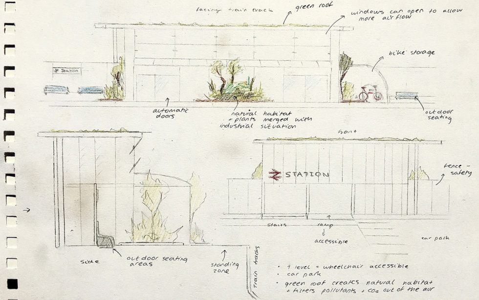
Stella made a strong effort to integrate greenery into the architecture of the station. Her designs are very clear and focused on a singular topic: how to merge natural habitat and plants with an industrial infrastructural situation.
The station itself is simple in its rectangular form, but holistically integrates the green roof and the natural habitats. Particularly impressive is her integration of gardens into the train platform experience itself. This is something that we can certainly integrate into a real train station design to create a greater feeling of wellness and tranquility for every passenger. Imagine if every commute felt like a walk in a nature reserve or a park!
Stella’s style is very technical and she has combined several different sections and elevations of the station to illustrate it as a whole. While Ayesha’s scheme was the most detailed, Stella’s was the most resolved as a spatial configuration rather than a picture.
Stella, we encourage you to continue developing your skills! You have a clear interest and ability of thinking three dimensionally and translating your ideas into two-dimensional drawings. To take yourself further, we would really encourage you to try variations of your design as you create it. Try one version that is extreme–how much planting and nature can you put into the design before it just seems impractical and too much? Compare the extreme one to the more practical one. How far can you push it? Often it is just at that border between practical and impossible where we discover the breathtaking.
We also suggest you continue drawing. Begin incorporating people into your drawings. Ultimately the goal of architecture is to create a beneficial environment and experience for its users. If you start to add simple figures doing particular things in your drawing, you will find that you start to tell a story of the human component.
But overall, amazing work Stella. You made a wonderful drawing and you will see we have incorporated some of your ideas into our station designs.
* * * * * * * * * * * * *
Other great submissions
We have listed here three more submissions from Gen Z students. Amazing work to all of you, and it was very difficult to choose just three to commend. We are also giving personalised feedback for those three submissions below!

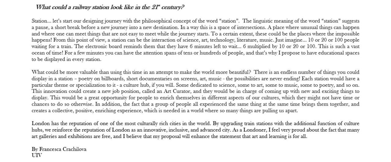
Francesca decided to focus on writing rather than drawing, and she had some amazing ideas. You can see them in the image above.
We love the way she begins with a deeper consideration of the origin of the word station. The design of architecture and our environment has a deep impact on so many people’s lives. As Winston Churchill said, “We shape our buildings and afterwards they shape us.” If this is true, is it better to take just a little longer to think more deeply before putting the pen to the page and just starting to design whatever comes to our minds? Perhaps so, and Francesca shows us one way of doing that.
We love how she takes something poetic (people coming together in a place of intersections and anticipations) and finds a way to quantify it. Imagine 10, 20, 100 people waiting for a train, 6 minutes later. 60, 120, 600 minutes of human experience, human shared experience, in that brief instant. As Francesca says, “a vast ocean of time!” This is a particular view of architecture and design that we haven’t often seen. Our train stations, possibly even our cities as a great well of human time, brought together in a single place.
Francesca’s concept of the educational space of the station, with an Art Curator for the branch line, is amazing. Why don’t we upgrade train stations throughout the country to enhance the cultural richness of the entire UK? Excellent work Francesca. If we had any suggestions for you to take your ideas and inspirations further, it would be that you might start putting some of these concepts to the page in visual form. It doesn’t necessarily have to be a drawing or painting that you create yourself. It can also be a collage you make of existing images, or a collection of example public spaces and public art that you think communicates some aspects of your vision. Perhaps you could take a look at a particular branch line or a several branches of the rail network and think more spatially about how different educational and cultural experiences could be cleverly distributed according to a concept!
* * * * * * * * * * * * *

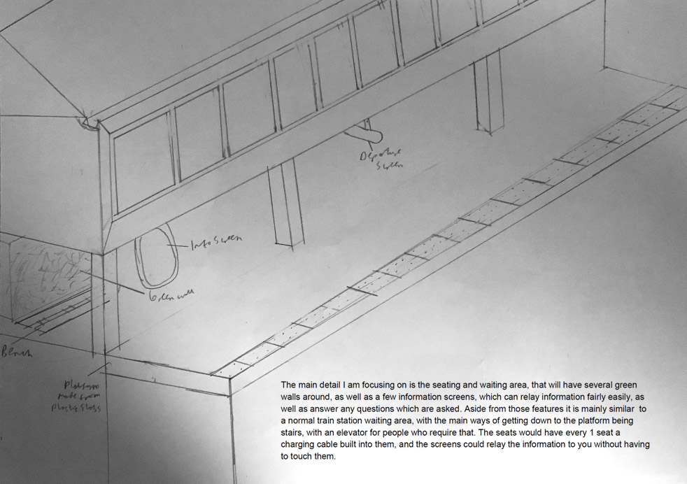
Harris has made an interesting isometric drawing of his station proposal. He has put a green wall on the platform and the station building itself sits on a columns and overhangs the waiting area, creating a natural shelter. Harris has chosen to focus on some of the technical details of the station itself, whether the tactile safety strip at the edge of the platform or the frames of the station glass and the gutter in the roof. We appreciate his tectonic approach to the problem-focusing on the material systems and forms involved in the station design.
It is a great idea to have a seating and waiting area with different green walls. If he would like to take his designs a step further, we would recommend exploring the way he draws to create more of a hierarchy where the central concept is prominent and takes centre stage. Perhaps the use of colour would also give life to the concept of the green wall. Harris could also find some interest in discovering which particular materials are more environmentally sustainable, and start thinking about how they might look visually. The floating station building with its windows overlooking the tracks and the town are intriguing. Could there be some development of what kind of functions would be up there, and how it might affect the design of the architecture? Great job Harris and thank you for your contribution!
* * * * * * * * * * * * *

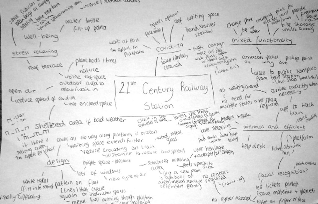
Lola has made a large, dense mind-map of the various different functional and creative ideas that she thinks could create a 21st century railway station. we love the introduction of plant beds, trees, and nature, and finding a way to make the station a stress-relieving place. It makes us think of William McDonough and Michael Braungart (authors of the book, Cradle to Cradle) who said that it shouldn’t be enough to make cars with less pollution: a great designer should make a car that actual makes the air cleaner the more you drive it! It is a great idea to make our train stations actually beneficial to people’s health.
We also like the fact that Lola responded to some of the constraints we have today with Covid, and also some of her more unusual ideas like having a parcel pick-up-point at the station and comfy bean-bags at the station. If we were to give her suggestions for taking her ideas further, it would be along similar lines to Francesca’s comments. Do push to create hierarchy in your ideas and find a way to make them visual in whatever way you can imagine. You will develop more confidence the more you do and the more you create. Thank you so much for your efforts!
* * * * * * * * * * * * *
Overall, it was amazing to see what everyone has created and submitted, and thank you in particular to Hannah and Apellia as well, who organised all of this in an amazing way. We will post some of our designs soon, and we can talk about different ways they might relate to the various ideas presented here in our first round of design submission competition! Thank you again to all!